
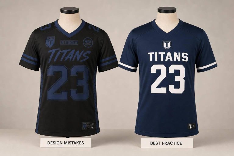
Most uniform problems start before production. In this piece, I’d boil the article down to five checks: use strong color contrast, pick easy-to-read fonts, place logos and numbers where they stay visible, keep the layout clean, and confirm sizing and fabric for the sport.
If I were reviewing a custom uniform order today, I’d do this first:
- Test contrast in grayscale and from about 50 feet
- Use bold block fonts for names and numbers
- Check placement on both the smallest and largest sizes
- Limit visual noise by choosing one main graphic move
- Run a sizing session with sample pieces before approval
That matters because bad reads and bad fit can lead to rule issues, player mix-ups, and extra costs from rush reorders and shipping. The article also points out fabric ranges like 140–160 GSM for basketball or volleyball and 180–240 GSM for football or lacrosse, which shows how much sport type affects fit and wear.
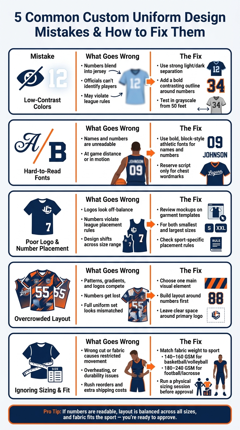
5 Common Custom Uniform Design Mistakes & How to Fix Them
Quick Comparison
| Mistake | What goes wrong | What I’d do |
|---|---|---|
| Low-contrast colors | Numbers blend into the jersey | Use stronger light/dark separation and add outlines |
| Hard-to-read fonts | Names and numbers are tough to read at a distance | Stick with bold athletic fonts |
| Poor placement | Logos or numbers look off or break league rules | Review on garment templates across size ranges |
| Overcrowded layout | Patterns and effects fight for attention | Keep one main graphic idea and protect number space |
| Ignoring sizing and fit | Players get the wrong cut, feel, or fabric | Use product-specific charts and physical samples |
Bottom line: if you can read the numbers fast, the layout looks balanced on every size, and the uniform fits the sport, you’re in good shape before placing the order.
sbb-itb-4d95ad3
Why Poor Uniform Design Costs Teams More Than Just Looks
Bad uniform design doesn’t just lead to ugly jerseys. It creates game-day headaches and hits the budget too. The biggest trouble usually comes from hard-to-read numbers, poor placement, and bad fit.
Readability is the first problem. If numbers are tough to read, officials can get confused, and teams can run into league-rule issues. Many leagues set strict rules for number size, color contrast, and logo placement. Miss those marks, and penalties can follow.
A design that looks balanced on-screen can fail on a moving body.
Fit issues tend to create the biggest repair and replacement bills. When teams skip physical sizing samples and depend on generic charts, they often end up with uniforms that don’t fit across the full roster. That gets even messier when the order mixes youth and adult sizes. The result is usually rush reorders, rush shipping fees, and a lot of avoidable stress.
Start with contrast, because it affects every other design choice.
1. Low-Contrast Colors That Hurt Readability
The most common mistake is low contrast. When a player’s number sits too close in brightness to the jersey’s base color, it starts to melt into the fabric. From the stands, that can make names and numbers hard to read fast. That’s a problem for officials, fans, and league rules, since many leagues require minimum contrast levels for player identification.
A design can look slick on a screen and still fall apart under gym lights or on a field at night.
A simple way to test this is to use a grayscale mockup and do a 50-foot check before you approve the design. If the numbers don’t stand out right away, the contrast isn’t strong enough. And if a color combo is close but not quite there, a bold, high-contrast outline around numbers and letters is often enough to fix it.
Low contrast doesn’t just affect the jersey. It can cause issues across the whole uniform set. A look that works on the top may feel off once it moves to shorts, socks, or warm-up gear. Sticking with a simple palette – two main colors and one accent – usually keeps the full set balanced. And when you place the order, send Pantone codes so colors stay consistent across fabrics and production runs.
Once contrast is dialed in, font choice becomes the next readability test.
2. Hard-to-Read Fonts and Typography
Decorative and script-heavy fonts often push letters too close together. That makes names and numbers tougher to read. And a font that looks sharp on a laptop can fall apart on a jersey once you see it from a distance. So font choice becomes the next readability test.
The safest pick for player names and numbers is a bold, block-style athletic font. These styles stay legible from a distance and under different lighting conditions. If a number can’t be read at a glance, the uniform isn’t doing its main job.
Stick with one type family for names and a matching number style to keep the set clean. Too many fonts make the design feel cluttered.
Script works best as an accent, like a chest wordmark. For names and numbers, keep block fonts in place for legibility. Decorative type is fine only when it doesn’t affect names and numbers.
Review the mockup on a garment template, not just on a flat screen, and check that it reads cleanly at every size. Once the type is easy to read, placement becomes the next visibility test.
3. Poor Placement of Logos, Names, and Numbers
Even if you pick the right font and colors, the uniform can still miss the mark if the pieces sit in the wrong place. Placement shapes visibility, balance, and how the design moves with the athlete. It also affects whether the uniform follows league rules.
Balance plays a big part here. A chest logo that sits too low can make the whole design feel heavy at the bottom. Shoulder patches that don’t line up can make the uniform look off, even when everything else is done well.
| Placement Area | Common Purpose | Design Risk |
|---|---|---|
| Front Chest | Primary Logo / Wordmark | Placed too low; looks bottom-heavy |
| Back | Player Name / Number | Font too stylized or small; unreadable from the stands |
| Sleeve Panels | Secondary Logos / Flags | Misaligned patches; throws off balance |
| Shoulders | Patches / Numbers | Too close to the neck; bunches up during movement |
Placement also needs to work across the full size run. That’s where problems often show up. A layout that looks centered on an adult XL can shift on a youth small.
Sport-specific placement matters too. In baseball, graphics should work around the button placket. In basketball, graphics need to stay clear of side seams.
Before you approve an order, ask for mockups of both the smallest and largest sizes. That’s the simplest way to make sure the placement still looks right from one end of the size range to the other.
And once too many elements start fighting for room, clutter becomes the next issue.
4. Overcrowded Layouts and Visual Clutter
Too many patterns, gradients, textures, stripes, slogans, or effects can push a uniform into clutter. And once that happens, names and numbers get harder to read from the stands.
It also creates a second problem: the full set starts to fall apart. A busy jersey may look fine on its own, but it’s much harder to carry that same look cleanly onto shorts, socks, and warm-ups. That’s when the pieces stop feeling like they belong together.
The fix is pretty simple: clean up the layout before you fine-tune the details. Choose one main visual move – a bold pattern or a gradient, not both. Then build the design around the numbers first. After that, leave clear space around the primary logo so it doesn’t get lost under other graphics.
| Design Element | Problem When Overcrowded | Recommended Fix |
|---|---|---|
| Numbers | Hard to read against busy patterns or gradients | Use a bold athletic font with high contrast |
| Logos | Lost near seams or competing with other graphics | Leave clear space around the primary logo |
| Patterns | Create clutter that weakens team identity | Limit the design to one main pattern or texture |
| Full Set | Jersey, shorts, and socks feel mismatched | Plan the full visual system together |
Once the layout is clean, the next step is to check whether the cut and fabric still fit the sport.
5. Ignoring Sizing, Fit, and Sport-Specific Function
The last design check is fit and function. A sharp layout doesn’t matter much if the uniform fits poorly. And this is where teams get burned: fit issues often show up after approval, once color, type, placement, and layout are already locked in.
The problem usually starts early. Teams guess sizes based on last season or assume every medium fits the same. It doesn’t. Fit can change a lot based on fabric and cut, so a lightweight 140–160 GSM mesh jersey for basketball won’t fit like a 180–240 GSM pro-game mesh uniform for football or lacrosse. If you order without thinking through those differences, players may feel restricted or end up with uniforms that look loose and off on the field.
"Poor fit turns a good-looking uniform into a performance problem."
Function matters just as much. The right uniform has to work for the sport, not just look good in a mockup. Basketball and soccer call for lightweight, breathable fabrics that move with the body. Football and lacrosse need heavier, abrasion-resistant materials that can take contact and leave room for protective pads underneath.
Use the table below to line up fabric weight and function with each sport.
| Sport | Recommended Fabric Weight | Key Performance Need |
|---|---|---|
| Basketball / Volleyball | 140–160 GSM Mesh | Max mobility and breathability |
| Soccer | 130–160 GSM Polyester | Lightweight moisture control |
| Football / Lacrosse | 180–240 GSM Pro-Game Mesh | Abrasion resistance and durability |
Roster-wide sizing adds one more challenge. Size grading should cover youth, adult, and plus sizes so logos and numbers stay proportional across every jersey. For youth uniforms, adjustable waistbands or drawstrings can help with mid-season growth.
A short sizing session at practice can save a lot of trouble later. Set aside 15 minutes and have players try on a physical sizing kit or sample pieces while wearing the same undergarments or equipment they use in games. Then measure each player’s chest and waist and compare those numbers to the product’s size chart, not a generic size label.
It’s also smart to save the final design specs, including font types, art placement, and color hex codes, so mid-season reorders match the first batch exactly.
Quick-Reference Comparison Table
Use this checklist to catch problems before artwork is approved.
| Mistake | Problem | Impact | Best Fix |
|---|---|---|---|
| Low-Contrast Colors | Numbers lose separation at a glance | Referees and fans can’t identify players; may violate league rules | Use high-contrast colors; add a contrasting outline to numbers |
| Hard-to-Read Fonts | Thin or decorative fonts read poorly at game distance | Player identification fails from a distance or in motion | Choose bold, athletic fonts with clear spacing |
| Poor Placement | Logos, names, or numbers are out of scale or alignment | Hurts balance and readability | Review designs on real garment templates, not flat mockups |
| Overcrowded Layouts | Too many patterns, gradients, and logos compete for attention | Reduces readability and weakens team identity | Pick one hero element; keep the rest of the layout clean |
| Ignoring Sizing & Fit | Wrong sizing or fabric choice | Causes restricted movement, overheating, or durability issues | Use product-specific size charts and match fabric weight to sport intensity |
If any row raises a flag, fix it before moving to the approval step.
How to Review Your Design Before Placing an Order
Once your proof shows up, treat it like the last checkpoint before production. This is your final chance to catch small mistakes before they turn into a full run of printed garments.
Start with the roster. Match every name and number against the spreadsheet, then check spelling, spacing, and numbering one more time.
Next, look at the logos. Vector art is the best option for print. If you have to use a raster file, make sure it stays at 300 DPI at final print size.
For color, don’t rely on your screen. Screens can fool you. Check color against Pantone codes instead. If contrast still feels iffy, run a grayscale test to see whether the design holds up without color doing all the work.
Then review the design on a garment template. This helps you spot problems like seam interference, cropped art, or numbers and logos sitting too close to a hem.
Last part: get two other people to review the proof. After that, have one person gather all feedback and send the final approval so only one version moves forward. Once the notes are merged, approve only the final version.
Conclusion
Great uniforms come down to four basics: easy-to-read contrast, clear typography, correct placement, and a fit built for the sport. When you review a proof, those are the first things to check. That’s why the final review carries the most weight.
These five mistakes can be avoided with a tighter review process before approval. A final proof check helps prevent avoidable reorders and keeps the roster consistent. Wooter Apparel offers free custom designs and fully sublimated options to help teams move from proof to production.
FAQs
How can I test uniform readability before ordering?
Use strong contrast between the base color, player names, and numbers. Then review the digital mockups closely. Look for clear fonts, proper sizing, and the same placement across the set. It also helps to check the design in grayscale so you can see if the contrast still holds up when color cues disappear.
If you can, ask Wooter Apparel for a physical sample. A mockup on a screen is helpful, but fabric can change how a design looks in person, especially from a distance. Bring in a few team members during proofing too. More eyes on the design can help catch readability problems before anything goes to print.
What font styles work best for names and numbers?
Use bold, athletic fonts that stay easy to read from a distance. For names and numbers, block fonts are usually the safest choice. They’re clear, direct, and easy to pick up during play.
Stylized or decorative fonts might look great on a screen, but they often fall apart in a game setting. If a player, coach, or fan can’t read them at a glance, the design isn’t doing its job. A simple setup works best: use one font for names and one for numbers, keep that typography consistent, and test the jersey from a distance.
How do I choose the right fabric and fit for my sport?
Choose fabric based on the physical demands of your sport and the climate where you play. In hot weather or during high-intensity games, go with breathable, moisture-wicking materials like polyester or mesh. They help players stay cooler and drier when the pace picks up.
For contact sports, look for heavier fabrics that can handle wear and tear while still offering stability and stretch. You want material that holds up under pressure without limiting movement.
When it comes to fit, skip the one-size-fits-all approach. Take accurate measurements for each athlete, and ask Wooter Apparel for sample uniforms or fit kits before you place a bulk order.